Sunday, January 22, 2023

Can we enter recession without layoffs?

On recent episode of Inside Economics podcast, there was a question raised whether we can get recession without layoffs. There are two parts to this question: Can we enter recession without layoffs, and can we go through recession without layoffs? I think the latter is pretty hard to achieve and it would require very mild recession, at which point it is a question whether given period actually amounted to a recession or not. It the former question which is more interesting.

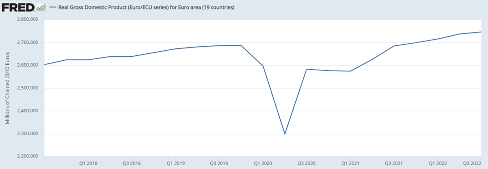
So, can we enter recession without layoffs? I think the answer is not only “Yes”, but that we have already had such experience. Consider a following pair of pictures capturing labor market aggregates (first picture) and GDP with unemployment rate (second picture) in particular historical period. (On purpose I omitted the date axis, which will be revealed at the end, but bonus points for guessing it outright 😉) .


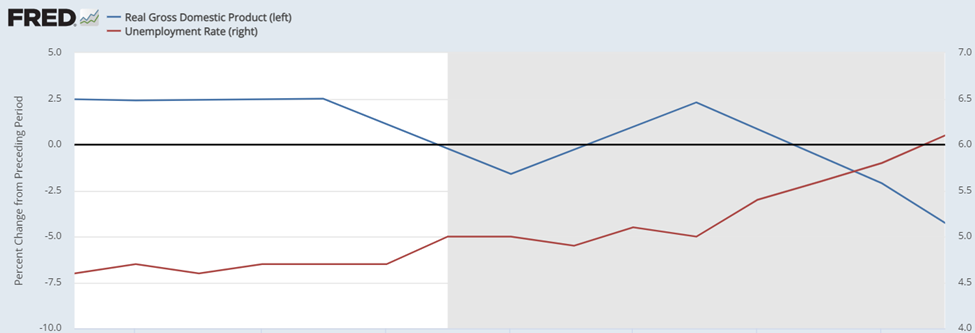
The second half of this period was officially categorized as recession. This is not very surprising as during this time monthly hiring has declined significantly from 5.2m to 4.5m, dragging down with it the employment, which has declined by 1.7m from 138.4m to 136.7m. Meanwhile, unemployment rate increased from 4.7% to 6.1%, while GDP had two quarters of negative growth intersected by a positive quarter. Overall, this is clearly consistent with recession, albeit not a particularly severe one.

The key point, though, is in the layoffs series, replicated once more with slightly extended sample:


While layoffs did increase a bit, the increase was very small amounting to 200k-300k, less than half of decline in hirings. Moreover, this increase occurred only towards the end of our sample. Before layoffs did not record any increase (at best they were bit elevated) while employment already managed to decline by 0.5m.

The conclusion is simple: we have already had an experience when we entered recession without widespread layoffs. Therefore, even if firms will hesitate to lay off people – something that I think will be a feature of potential 2023 recession – we might enter recession in 2023. All that it would take would is for firms to significantly decrease their hiring, something that is possible even if they will be hesitant to let their current employees go. In such situation employment will start to decrease and unemployment rate will start to increase, eventually tipping us into recession. And then the layoffs will likely come. (Indeed, one can imagine that if we do tip into recession, then the eventual layoffs might become more aggressive then initially thought, given that firms will be postponing layoffs for long period of time.)

So what was the period of time captured in the pictures? It was the onset of Great Recession:


Of course, after the end of the picture employment continued to tank as hiring decreased further, and more importantly, layoffs increase:


The other way to see the argument is to look at the cumulative effect of each of the flow category on the overall employment:


This shows that hires were initially the predominant source of shortfall in employment and that layoffs really kick in only in late 2008. Hence the conclusion that high layoffs are not necessary for unemployment to rise and for us to enter recession, low hiring will suffice. That said, given that this picture is quite sensitive to the choice of base date – layoffs were somewhat elevated in November 2007 already relative to say 2006 - a more qualified statement would be that large-scale layoffs are not necessary, low hiring and slightly elevated layoffs will do.

This is because even in normal month there is large amount of churn, with lot of laid-off people who quickly find new work, as long as hiring is robust. If it is not, then people who will be laid off as part of natural process, will not find work and will become unemployed.

P.S.: Someone might argue that this whole period might not have been classified as recession unless the financial crises escalated in September 2008 (official declaration came only in December 2008). That is possible, even if not very persuasive, given that employment decline was gathering pace already in the summer. 

Saturday, January 21, 2023

Addendum to ‘The power of choice of transformation, part 3’

When I was going through my rant about why year-over-year growth rate is not a good transformation for this period of volatile macroeconomic data, I might have made it look that I oppose it only during this period. In reality, I quite dislike year-over-year growth rate most of the time.

My biggest pet peeve is how is it used in news to indicate whether something has contracted or not in a given quarter. Take, for example, the Chinese GDP during 2022, shown in terms of level (blue) and in terms of growth rate:


It is obvious that Chinese GDP experienced two quarter when in contracted, that is second and fourth quarter of 2022, dropping by 2.7% and 1.1%, respectively in quarter-on-quarter terms (not shown here). Yet, in both quarters the year-over-year growth rate remained positive, effectively thanks to the accumulated growth in previous quarters.

And then comes a newspaper writer and writes “Chinese economy avoided contraction in second  quarter of 2022”. Come on, how useful and correct is that?! What really annoys me is the terminology "in given quarter here". There is no way to characterize the experience as avoiding contraction in given quarter, because within that given quarter there was a contraction. The absence of contraction in terms of year-over-year growth rate is about the other 3 quarters...

But oh well, I know that this just me insisting on words having a proper meaning...


Friday, January 20, 2023

The power of choice of transformation, part 3


The last part in this series is dedicated to the Covid recession, which  by the fact that it was lead to hugely anomalous data points makes life of macroeconomic analysts much harder. Here I will discuss how especially the usual transformation used in economic print, the year-over-year growth rate, end up not communicating almost anything to the user. In other words, this piece is really not about demonstrating power of transformation, but rather the lack of power.

Background: Basic transformations

Bit of background. Economists are mostly interested in how are things changing, rather than how things are. For stable macroeconomic time series like unemployment rate this poses no problem: graphing level will show you both where we are, and whether we are going up or down. But of trending time series this is not the case – if you take long enough sample then the increasing level screws up with the scale so that all you see you are now higher than in beginning, but not whether you have recently increased or decreased.[1]

The obvious solution is to use growth rate. But which one? We have simple growth rate, annualized growth rate, year-over-year growth rate… and recently even things like year-over-two-years growth rate! All of them have their place in the macroeconomists’ toolkit, and it is up to the economist to choose which one to use, giving us the power of choice of transformation. That is why they pay us the big bucks. Just kidding.

The most popular transformation in economic press is the year-over-year. This is probably for two reasons for this choice. First, year-over-year gives you comparable numbers like annual growth rate.[2] This is also true for annualized growth rate, which explains its use. However, year-over-year growth rate also has the advantage of not being too volatile, which is not the case for simple growth rate and especially not for annualized growth rate. This for example explains why year-over-year is THE statistic used for reporting GDP growth rates for emerging markets, which have more volatile quarterly series than developed countries, which either use simple growth rate (in case of euro zone) or annualized growth rate (in case of US).[3]

YoY growth rate and pandemic

This then explains why people usually use it. But here comes the catch: year-over-year growth rate is sometimes a horrible statistic for telling you the story. To see why, consider the case of euro zone GDP. Everybody roughly knows the story: GDP decline in 2020q1, then collapsed in 2020q2, before partially rebounding next quarter. Afterword it was mostly flat for next two quarters, before rebounding during the second and third quarters of 2021.


Now consider looking on the year-over-year growth rate of euro zone GDP during the pandemic:


Can you immediately tell the story from it? Well, for starters, there was a huge collapse in 2020q2. So far so good. But what about the  development in following quarters? Well, year-over-year growth rate was still very negative in 2020q3-2021q1, albeit less. This tells you that GDP was still lower than year before. Finally, in 2021q2 there is a spike, followed by a drop.

Looking at this you would hardly conclude that by far the biggest rebound was in 2020q3, unless of course you spend quite some time thinking it through. Instead, you would conclude that it was 2021q2 which was the best quarter. Of course, this was not the case and the strong year-over-year growth rate was really about the low comparison base from year ago – that is 2020q2.[4] Similarly, you would conclude that 2021q3 was much worse than 2021q2, which is not true. Simply, in periods of abnormal movements, such as the pandemic, year-over-year growth rate will often tell you more about what happened during this quarter last year, rather than the current quarter.

The lost power of transformation

But this drawback of year-over-year growth rate is not the main point of this post. Rather, the point is that this chart fails completely in it the main goal expected from charts: telling a story to the reader. Or even worse, it tells a misleading story. And yet, this is a chart which was common during the pandemic, and is still common. Simple, the authors are throwing away their power to tell a story with a chart by choosing the wrong transformation.

P.S.: What is the solution? Of course, simple growth rate would be the best growth rate here. But personally, I became a huge fan of indexed charts. Why? For starters, they tell you the same story like level of the series, which is really the story to tell here – down a lot, then partially up but not all the way.


Simple growth rate will struggle to communicate this – and might be even misleading due to its non-linearity. Second, unlike levels, index tells you also relative magnitudes. In the original level graph you could see that GDP went from 2,600,000 to roughly 2,300,000. But this is a completely useless information in that if it would be instead 5,200,00 and 4,600,000 it would tell you the same story. Simply, most readers have no idea about current level of GDP and such information is not valuable to them. Worse, what is really relevant to them is by how much are we lower, e.g. by 10% or 20%? To figure this out they would need to do calculation in their head.

And here comes in the power of index charts. From index chart you can see that you went to 85, and hence 15% below the index  quarter. Moreover, you can also easily read off the magnitudes of quarterly movements to get growth rate: for example, going from 85 to 96 tells you that you increased by 11% of the pre-crash value.[5] Hence index chart tells you the level story, while also containing basic information about the story of quarter-to-quarter changes.

P.P.S.: Lately I also started using index values for analyzing sequence of monthly data. Namely, I index all data to the same month of last year. Like that I can see the year-over-year growth rate, if I want to, but also have the story of levels, undisturbed by the base effects, which would be the case if I would be showing year-over-year growth rates.


[1] Unless of course you are looking at Italian GDP. 😉

[2] By annual growth rate I just mean the simple growth rate for data in annual frequency.

[3] Fun story: back during the depth of pandemic Czech business daily had article comparing the performance of US, euro zone and China. The problem? It was comparing the numbers are reported by statistical offices, and hence comparing simple growth rate with annualized growth rate with year-over-year growth rate. Yes, that is sometimes the quality of Czech business journalists.

[4] While it was a good quarter, that was just a coincidence which is almost irrelevant to the shape of the curve: Year-over-year growth rate would be huge even if 2021q2 would show moderate decline.

[5] Note that this is not the same as growth rate, which was more like 14%. That said, I would argue that it is more valuable information than growth rate: you don’t really care that you increased by 14% from 2020q2 level; it is more valuable to know that you have increased by 11% of the pre-crash value.

Sunday, January 15, 2023

The power of choice of transformation, part 2

The second piece in this series is dedicated to modelling and to monetary policy. It has been motivated by this nice chart from the Goldman Sachs:


This chart is highlighting that we should not think that recession is coming just because of the tightening we have seen already, because lot of the effect of tightening has already been felt simply because tightening has started almost a year ago. Which I think is important point to make and the chart is very useful in putting numbers to this idea.

That said, after thinking about this chart I started wondering whether it does not overstate its case. The odd thing that stroked me was the fact that the effect of the tightening is tending to zero over time. At first glance it does sound reasonable that after tightening ends the effect it has should gradually become zero. And in-so-far as focusing on the process of tightening (that is raising rates), this is just logical conclusion.

However, that is not how this graph is being used and interpreted. The chart was being used to argue that the impact of monetary policy as such is going to wane in coming quarters, which is a different point from the impact of just the tightening process. The point to realize is that the end point of tightening is relevant; in other words, if we end up with high interest rates[1], then that should have negative effect on growth irrespective of whether the rates are being raised further or not. In the parlance of Fed, they want to raise rates to rates to restrictive level and keep them there. The use of word “restrictive” implies that that high level will have continuously negative effect on aggregate demand as long as rates are at that level. In other words, the effect of tightening will be non-zero even after the end of the tightening process; as higher rates stay, the effect will stay as well.

How is this all related to power of transformation? Well, in the report where the chart was used the authors come clean and say that the model links the effect on growth to changes in the financial conditions index. This then leads to the conclusion that when changes in monetary policy go to zero, the effect goes to zero. However, the choice of changes in financial conditions as the driver of growth is not as self-evident as it might seem. I can as plausibly argue that it is the level of financial conditions that is relevant for growth, with high level implying lower growth. Indeed, this is what one would take away from standard macroeconomics models.

Ultimately, the point is not that either changes or level is the correct choice.[2] I think it is fair to say that both matter: level is important, but rapid changes in level can carry much bigger punch than the change in level alone would imply, and hence changes are important too. The point is different: The story the chart (and underlying model) say is really a function of the choice of transformation; if different transformation would be used, the story would be completely different. Hence the power of choice of transformation.


[1] High of course needs a benchmark, as in high relative to what. Here I mean high relative to (long-term) neutral rates.

[2] I would view this view irrespective of econometric arguments. For example, I am pretty sure the authors chose changes in financial conditions index either because they  concluded that the series has a unit root, or because they concluded that it fits better. Neither of these would persuade me that this is the only correct perspective.

Saturday, January 7, 2023

The power of choice of transformation, part I


Two example recently reminded me about a thought I have been having for a while: Sometimes it feels that most of macro analysis is really about choosing the right transformation. I will illustrate it in three posts. First, a post about euro zone energy inflation.

For most of the 2022 there was a discussion about whether the spike in euro zone inflation is driven solely by surge in energy prices, or whether it is more broad-based. (Of course, the truth is somewhere in between those two…). One side was pointing out that half of the inflation was accounted for by energy component directly:


Of course the other side countered that also the other non-energy components are elevated and that inflation is very broad-based:


To which the first side countered that it is because of energy – i.e. pass through. And here comes the power of choice of transformation. How do you make the case that energy drives the rest of the basket, or that it does not? Enter a chart from Riccardo Trezzi (tweet has been deleted since):


Looks like energy CPI goes up and down all the time without causing any large spike in overall CPI, right? Implying that the current spike in energy should not be the cause for spike in overall inflation, given that it is not that abnormal, right? Well, look again, this time using the level of both series rather than the y/y growth rate:


This paints completely different picture: while there were surges in energy prices before, the current surge is simple in a league of its own (and there even isn’t another professional league…). Energy prices have surged by almost 100% in period of 1,5 year, with previous largest surge in similar period was more like 25%.

My point is not to settle the debate. My point is to show how the simple act of choice of transformation wields immense power in macroeconomic analysis. As I always say, good statistician./macroeconomist can show anything with any dataset…

The future perspective on current monetary policy


Ever since the Fed and the ECB have embarked on their journey of rapid tightening, there was a heated debate about the appropriateness of this policy. Ultimately, this question rests on the persistence of current inflation, which pits against each other the by-now-infamous team transitory against their opponents of team persistent. At this point it is fair to say that we really don’t know which side was correct, or maybe more precisely, which side was more correct, as neither of the extreme perspectives were likely correct. But what about in future, will we know? I don’t think so. I think both sides will claim forever that they were correct, and ultimately, the actions of the central banks will prove both of them correct.

What do I mean? Imagine that in a 1-2 years  from now inflation is back to around target. What does that mean for team transitory and team persistent? Team transitory will be able to point out to inflation back to target and say “See, the inflation spike was after all not persistent, given that we went back to target. Of course, the team persistent will say that the only reason why inflation went back to target was because of the action by central banks, which broke down the persistent inflation, and that without such action the inflation would be persistent. And as for central banks themselves, clearly, if inflation comes back to target, they will feel vindicated, claiming that their policy was correct all along. Hence, inflation going back to target settles nothing.

Arguably, if inflation only goes back to 2% and not below, I would conclude that team transitory was not correct: the rapid tightening clearly will have impact  on inflation rate, and hence if even with it we do not undershoot, then in absence of it we would have overshot the target.

Now imagine that in 1-2 years from now, inflation is actually well below target, likely in combination with recession between now and then. Does this change the debate? Does it vindicate team transitory? I don’t think that team persistent will accept defeat in this situation. They will claim that the inflation was persistent, and that central bank had no choice but to tighten rapidly, even if it meant recession and below-target inflation rate. They will point out that in absence of such action the sky-high inflation rate would lead to de-anchoring of expectations and inflation persistently above target. In other words, the argument was that breaking down the high inflation and landing exactly on target simply was not in cards.

Arguably, in such situation I would conclude that team persistent was not correct: while I can see a case to be made about inflation expectations de-anchoring, like this kind of Jedi Mind Economics is not really persuasive for me: we have very little understanding of how expectations get formed, what can cause inflation expectations to de-anchor, and whether that would actually meaningfully influence inflation. So if the argument rests solely on theocratizing about evolution of inflation expectations, count me out. (I am not saying that inflation expectations are irrelevant, just that given our current empirical understanding, I would not make them central to my explanations of empirics).

Only if inflation even after 2 years is still clearly above target is there a chance that the discussion will be concluded. It will be hard for team transitory to argue that 4 years of high inflation is really a transitory phenomenon. That is, unless there is further shock along the way, but again, that to me will start to feel tenuous.