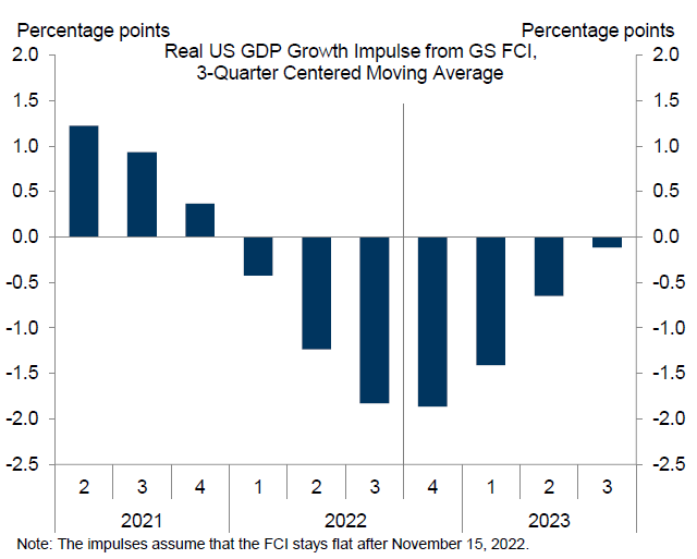
The last part in this series is dedicated to the Covid recession, which by the fact that it was lead to hugely anomalous data points makes life of macroeconomic analysts much harder. Here I will discuss how especially the usual transformation used in economic print, the year-over-year growth rate, end up not communicating almost anything to the user. In other words, this piece is really not about demonstrating power of transformation, but rather the lack of power.
Background: Basic transformations
Bit of background. Economists are mostly interested in how
are things changing, rather than how things are. For stable macroeconomic time
series like unemployment rate this poses no problem: graphing level will show
you both where we are, and whether we are going up or down. But of trending time
series this is not the case – if you take long enough sample then the increasing
level screws up with the scale so that all you see you are now higher than in beginning,
but not whether you have recently increased or decreased.[1]
The obvious solution is to use growth rate. But which one?
We have simple growth rate, annualized growth rate, year-over-year growth rate…
and recently even things like year-over-two-years growth rate! All of them have
their place in the macroeconomists’ toolkit, and it is up to the economist to
choose which one to use, giving us the power of choice of transformation. That is
why they pay us the big bucks. Just kidding.
The most popular transformation in economic press is the
year-over-year. This is probably for two reasons for this choice. First, year-over-year
gives you comparable numbers like annual growth rate.[2]
This is also true for annualized growth rate, which explains its use. However,
year-over-year growth rate also has the advantage of not being too volatile,
which is not the case for simple growth rate and especially not for annualized
growth rate. This for example explains why year-over-year is THE statistic used
for reporting GDP growth rates for emerging markets, which have more volatile quarterly
series than developed countries, which either use simple growth rate (in case
of euro zone) or annualized growth rate (in case of US).[3]
YoY growth rate and pandemic
This then explains why people usually use it. But here comes
the catch: year-over-year growth rate is sometimes a horrible statistic for
telling you the story. To see why, consider the case of euro zone GDP. Everybody
roughly knows the story: GDP decline in 2020q1, then collapsed in 2020q2,
before partially rebounding next quarter. Afterword it was mostly flat for next
two quarters, before rebounding during the second and third quarters of 2021.
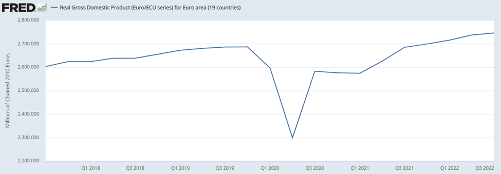
Now consider looking on the year-over-year growth rate of euro
zone GDP during the pandemic:

Can you immediately tell the story from it? Well, for
starters, there was a huge collapse in 2020q2. So far so good. But what about the
development in following quarters? Well,
year-over-year growth rate was still very negative in 2020q3-2021q1, albeit
less. This tells you that GDP was still lower than year before. Finally, in 2021q2
there is a spike, followed by a drop.
Looking at this you would hardly conclude that by far the
biggest rebound was in 2020q3, unless of course you spend quite some time
thinking it through. Instead, you would conclude that it was 2021q2 which was
the best quarter. Of course, this was not the case and the strong
year-over-year growth rate was really about the low comparison base from year
ago – that is 2020q2.[4]
Similarly, you would conclude that 2021q3 was much worse than 2021q2, which is
not true. Simply, in periods of abnormal movements, such as the pandemic,
year-over-year growth rate will often tell you more about what happened during
this quarter last year, rather than the current quarter.
The lost power of transformation
But this drawback of year-over-year growth rate is not the
main point of this post. Rather, the point is that this chart fails completely
in it the main goal expected from charts: telling a story to the reader. Or
even worse, it tells a misleading story. And yet, this is a chart which was common
during the pandemic, and is still common. Simple, the authors are throwing away
their power to tell a story with a chart by choosing the wrong transformation.
P.S.: What is the solution? Of course, simple growth rate
would be the best growth rate here. But personally, I became a huge fan of
indexed charts. Why? For starters, they tell you the same story like level of
the series, which is really the story to tell here – down a lot, then partially
up but not all the way.

Simple growth rate will struggle to communicate this – and might
be even misleading due to its non-linearity. Second, unlike levels, index tells
you also relative magnitudes. In the original level graph you could see that
GDP went from 2,600,000 to roughly 2,300,000. But this is a completely useless
information in that if it would be instead 5,200,00 and 4,600,000 it would tell
you the same story. Simply, most readers have no idea about current level of GDP
and such information is not valuable to them. Worse, what is really relevant to
them is by how much are we lower, e.g. by 10% or 20%? To figure this out they
would need to do calculation in their head.
And here comes in the power of index charts. From index
chart you can see that you went to 85, and hence 15% below the index quarter. Moreover, you can also easily read
off the magnitudes of quarterly movements to get growth rate: for example, going
from 85 to 96 tells you that you increased by 11% of the pre-crash value.[5]
Hence index chart tells you the level story, while also containing basic
information about the story of quarter-to-quarter changes.
P.P.S.: Lately I also started using index values for
analyzing sequence of monthly data. Namely, I index all data to the same month
of last year. Like that I can see the year-over-year growth rate, if I want to,
but also have the story of levels, undisturbed by the base effects, which would
be the case if I would be showing year-over-year growth rates.
[1]
Unless of course you are looking at Italian GDP. 😉
[2] By
annual growth rate I just mean the simple growth rate for data in annual frequency.
[3] Fun
story: back during the depth of pandemic Czech business daily had article
comparing the performance of US, euro zone and China. The problem? It was
comparing the numbers are reported by statistical offices, and hence comparing
simple growth rate with annualized growth rate with year-over-year growth rate.
Yes, that is sometimes the quality of Czech business journalists.
[4]
While it was a good quarter, that was just a coincidence which is almost irrelevant
to the shape of the curve: Year-over-year growth rate would be huge even if
2021q2 would show moderate decline.
[5] Note
that this is not the same as growth rate, which was more like 14%. That said, I
would argue that it is more valuable information than growth rate: you don’t really
care that you increased by 14% from 2020q2 level; it is more valuable to know
that you have increased by 11% of the pre-crash value.